The 12 animation principles was created by the animators for Walt Disney in the 1930s and has been used by all animators ever since.
1. Squash and Stretch
This is where you give weight and volume to a character as it moves. From walking, running, jumping to facial expressions and the bouncing of a ball.
GOOD:
I chose Kirby as a good example because Kirby acts like a squishy, malluable ball that engulfs his enemies by changing his shape. The way he jumps, moves, and flies shows his weight and physical matter very well.

Here is some game play footage of one of the many Kirby games which helps illustrate my point on Kirbys flexibility and being a good example of the Squash and Stretch principle.
BAD:
 As for bad, i chose Minecraft. Minecraft is very static with little fluid movement and facial expression. It is very blocky with its movement and when the characters jump it is very standard and static.
Here is footage showing my points on static movement and a blocky movement.
2. Anticipation
This is where just before a major action the character is about to perform that prepares the audience for what is about to happen. There is a backwards motion that is performed before the final action is executed e.g. punching someone. You move your arm backwards before you move it forward to deliver the punch.
GOOD:
WWE All stars is a good example as for it to be as realistic as possible, they have to have the anticipation, the backwards motion before the execution of the action.
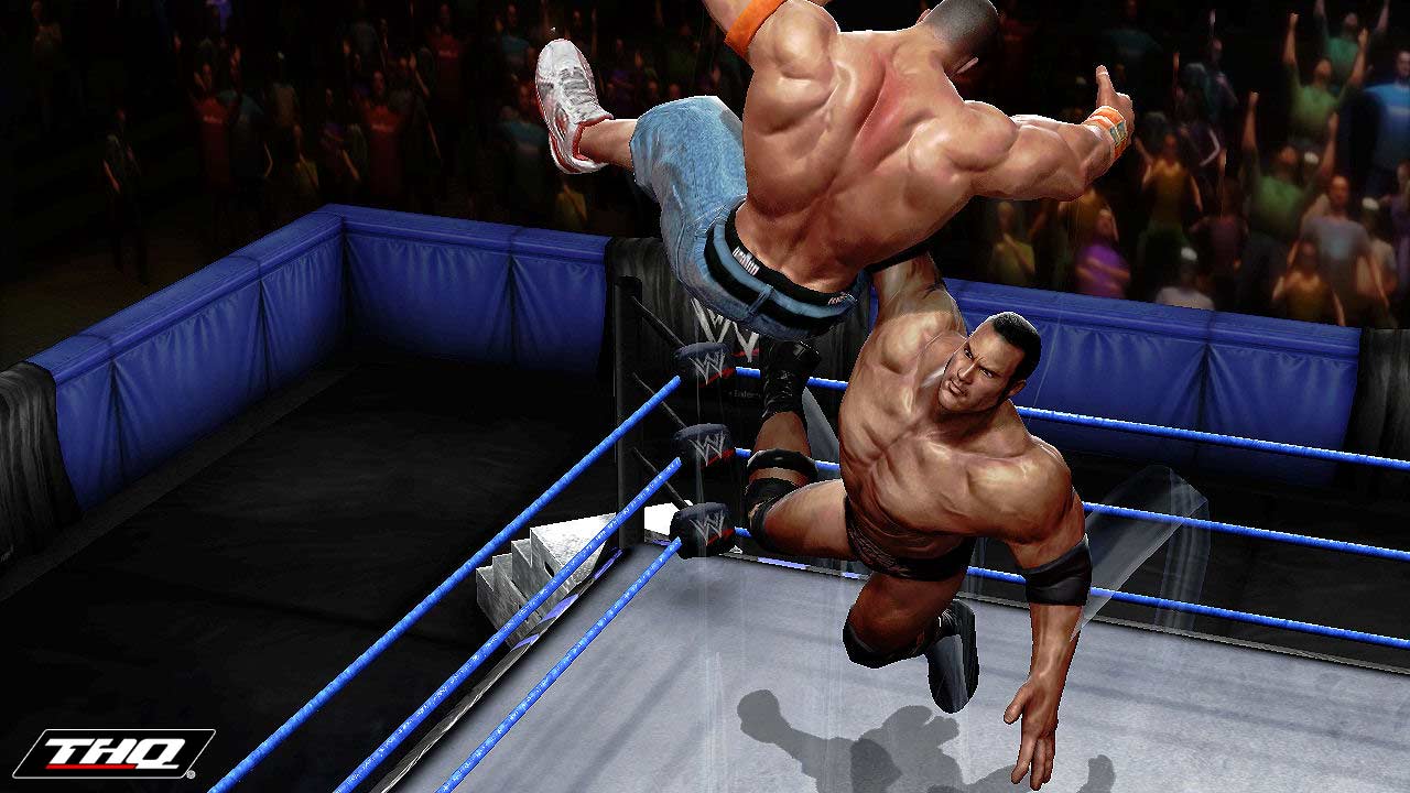
As you can see in the video, there are examples of the Anticipation e.g. When Triple H goes to grab and pick up John Cena, his arms move back before he goes to grab him.
BAD:
I have chosen Pokemon as my example as there is no backward motion at all for running and jumping. In battle there is no movement at all when the Pokemon perform their moves.

3. Staging
A pose or action that the audience can clearly pick up on the mood, reaction or feelings of the character in the story with the use of camera angles and long, medium or close up shots to help tell the story. It is important to not confuse the audience with too many actions at once, each sequence must clearly relate to the story.
GOOD:

This is the Opening Cinematic for The Legend of Zelda: Skyward Sword. It uses a range of camera angles, clearly shows who the main character is, who the evil characters are and other important characters for the story line whilst being easy to follow and not overly complicated.
4. Straight Ahead and Pose to Pose
Straight ahead animation is where you draw the whole scene out individually which can result in loss in size, volume and proportions making the scene look untidy and disjointed but fast paced action scenes are done this way giving freshness and spontaneity.
Pose to pose is planned out with drawings in the scenes are done at intervals keeping size, volume and proportions a lot better.
I found this really hard to find an example for, good or bad! So i'm afraid i have no example for this one, i think you can see why!
5. Follow Through and Overlapping Action
Follow Through is where the main body of the character stops but other parts continue to catch up to the main mass of the character e.g. arms, hair, clothing, ears, tails; nothing stops all at once.
Overlapping Action is when the character is moving but then changes direction whilst the hair or clothes etc continue to move forward in the previous direction, drag. Timing is critical for the effectiveness of drag and overlapping action to make it seem more realistic.
GOOD:
For this example I chose Final Fantasy 13 as when Lightning fights you can see her hair and cape still moving trying to catch up with her when she stops moving. This video shows both follow through and overlapping actions.

6. Slow In and Slow Out
They slower sections of action making it more life like. There are more drawings near the starting pose, one or two in the middle and more in the next pose. Fewer drawings make the action faster and more make it slower.
GOOD:
This is the opening cinematic for Kingdom Hearts 2 which shows slow ins and slow outs which is varied in the clip.

7. Arcs
Most actions in life follow an arc/slightly circular path. Arcs give animation a more natural action and a better flow. For head turns and arm movements etc, they follow this arc.
GOOD:
In Mortal Kombat the characters fight so they have to (anatomy wise) be realistic and accurate and their bodies and movement do follow arcs and curves.
BAD:
8. Secondary Action
A secondary action adds and enhances/re-enforces the primary action. e.g. forcefull and agressive walk with stomping feet/legs is the primary action. Secondary action would be guestures of the arms. The two have to work together and the secondary action shouldn't distract from the primary action.
GOOD:
In God Of War, when they are fighting the primary action is the aggressive fighting with wielding the weapons and the secondary action are the noises whilst fighting.
9. Timing
The more drawings between poses, the slower and smoother the action. The fewer drawings between poses, the faster the action. Variety of the two makes it visually interesting.
GOOD:
Here we have Robot Unicorn Attack with a slown down video of the gameplay. As you can see in the video there are about 2 or 3 frames when the unicorn headbutts creating a quick fluid action. You will have to go a minute or so in the video to see it.


10. Exaggeration
To enhance a walk, facial expression or even a head turn to give the action more appeal and sometimes more natural.
GOOD:
I have chosen Bayonetta as Bayonetta herself is a powerful character with an attitude who is quite over the top. In the video it shows her fighting with exaggerated arm and leg movements and when she walks she walks with an exaggerated sway with her hips and legs.

11. Solid drawing
It is a basic form of drawing something to give it weight and form and three dimension.
12. Appeal
Appeal in any character good or bad comes with a clear drawing and being able to clearly see their personality and their role in the story.
GOOD:
I have chosen Mario as Mario is a fun character that appeals to all ages, young and old. His personality is clearly shown in his actions, reactions, sounds and dialogue as well as design.


